Interesting science and data is all around us in our everyday lives. It sometimes just takes a paper and pen (or notepad app on your phone) in order to capture and analyze it. Having recently moved to a new city and new house, I decided that I wanted to statistically solve the age-old problem: which route is fastest for my drive to/from work? I narrowed the test down to 3 separate routes. When determining which one is the best, though, it's not as simple as driving them each a single time. I wanted to determine which one was statistically better over many trips to account for the changing road conditions, stop lights, time of day, etc. After all, saving 2 minutes from your daily commute can add up to over 8 hours per year (2 minutes per day * 5 days/week * 50 weeks of work/yr= 500 minutes!)!!
Results Summary
Data Source Stats
We have two different cars (Passat and Explorer); I also collected data in both the morning and evening. I've included the statistics for how much each car and route were driven. I recorded data for a total of 35 trips (over a period of a few months):
Here we can see that route 2 had more overall trips, but overall the trips were mostly evenly spread. Regarding car, trips were recorded nearly evenly between the two. It did seem that I preferred to record data after my evening drive more than my morning. This may have been as a result of my haste to get into the office, I forgot to write down the drive time on several occasions.
Data Representation
I have been listening to an NPR podast called "Note to Self" that analyzes our relationship to data, social media, and technology. One interesting episode described two data scientists who recorded small details about their lives every week, drew sketches compiling this data in interesting ways, and sent it to each other on a postcard - NPR Note To Self - Facing our Weirdest Selves (see pictures of examples and audio of the episode). This episode inspired me to make a drawing that represented the data that I collected during this process as shown below:
I've represented the different routes by the three different colors (Route 1 - Grey, Route 2 - Orange, Route 3 - Blue). Morning and evening were drawn as circle or square respectively. Which vehicle was used (Explorer or Passat) was also represented, with trips in the explorer having a smaller shape inside, and Passat ones using the open symbol. The size of the shape represents the time that each trip took. The fastest trips are smallest, and the slowest trips use the largest symbols.
Dataset Statistics
On with the statistics: Tables that represented the statistic for trips along the three different routes are represented below:
I've included the average, standard deviation, max/min, and quartile 1/quartile 3 for the dataset along the different routes.
I also generated a Box Plot (using Excel's Stock Chart - which was tricky to learn), shown below.
From the table and Box Plot, we can see the differences more clearly. The average trip length for Route 1 was a bit higher than Route 2 and 3. However, Route 2 had the largest standard deviation and both the longest and shortest trip lengths. This may have been partially related to the fact that Route 2 also had the largest number of trips (40% of the total as shown in the Pie chart above). While one could with some certainty say that Route 1 seems longer than Route 2 and 3, a simple hypothesis test can show this.
Hypothesis Testing
Hypothesis testing can be used to determine whether two data distributions have the same mean values or not, known as T-testing in this case. This article from NIST.gov illustrates how to perform this test.
First, the T-statistic needs to be computed for the three cases (Route 1 vs Route 2, Route 2 vs. Route 3, and Route 1 vs. Route 3). The T statistic can be computed using:
Where YBar1 is the average for route 1, s1 is
the standard deviation, and N1 is the number of times driven.
Then the hypothesis should be rejected if
the t-test gives a significance of less than 5%.
This was computed using the excel
function =T.dist(-1*T, DOF, True); Where DOF (degrees of freedom) was computed using v- given in
the reference [or just N1+N2 -2 if equal variances are assumed]. Of course, this process can be skipped if the number of replicates is equal for the different cases.
The results are summarized in the following table:
Alpha is related to whether the two means are statistically different. Conventionally, if Alpha is greater than 5%, then the two cannot be said to be statistically different. On the other hand, if alpha is less than 5%, then the two can be said to be different. In this case, it is clear that Route 1 is different from 2 and 3. Route 2 and 3 are very nearly equal, and therefore can be presumed to be the same within error (although the hypothesis testing can never fully prove this since they may be similar, but not exactly the same).
Conclusions
Over the course of several months of data collection, I have determined that Route 1 is statistically slower than the others. Having been the one to collect this data, I believe that this may be for two primary reasons: 1. This route goes right by a high school, causing the morning commute to be delayed somewhat, and 2. This route was undergoing some construction, causing detours (that I, for the most part, left out of the dataset). Recently, I have been driving Route 2 almost exclusively, as it does seem to consistently take the least amount of time. Future studies might look at the number of miles for each route (gas mileage?), the number of stop lights, or possibly whether we can resolve a difference in time of day/the car that was used.


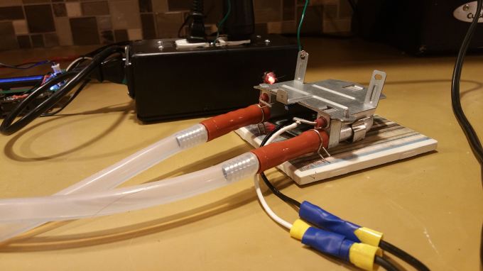
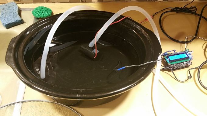
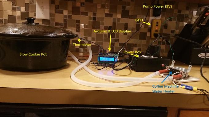 Here, I used a wall powered GFCI outlet (for safety), with the powerbox/arduino setup, a slow cooker pot, water pump, and a coffee machine water heater.